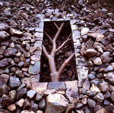
 Andy Goldsworthy created this piece called Hanging Tree as part of a series for a park. There were three pieces in total, all made from felled trees in the park. This particular tree is called the hanging tree because it is embedded into the stone wall around it and suspended above ground. The finished product almost gives the illusion of looking through a window. On the other hand, to me it almost seemed to represent the death of nature. The fact that the tree is in the ground and in a rectangular shape seems to suggest death.
Saturday, May 1, 2010
Hanging Tree (Post 9)
Andy Goldsworthy created this piece called Hanging Tree as part of a series for a park. There were three pieces in total, all made from felled trees in the park. This particular tree is called the hanging tree because it is embedded into the stone wall around it and suspended above ground. The finished product almost gives the illusion of looking through a window. On the other hand, to me it almost seemed to represent the death of nature. The fact that the tree is in the ground and in a rectangular shape seems to suggest death.
Diamond Skull (Post 8)

Damien Hirst's Diamond Skull was a very controversial piece when he first made it. The main issue people took with this particular piece of artwork is that it is an actual human skull. While on one hand this raises the question of respect for the deceased, it can also be pointed out that Hirst just modified an otherwise old tradition. The decoration of skulls is not uncommon in some cultures. Yet another issue raised with this piece is that the skull sold for a million dollars. Aside from the fact this again brings up the issue of disrespect, it also indicates that art is something material, to be bought. The fact that Hirst sold the skull for a million dollars seems a bit excessive.
Friday, April 30, 2010
Niki Lee (post 9)
 Niki Lee
Ohio Project of 1999
This image shows Lee in a barn laying on hay with a male figure and a dog. This picture portrays the life of a southerner, who may own the barn in which they are laying or he could work on the far in which the barn is located. Niki Lee poses herself to look like she is an a relationship with the male in the image and has suited herself in dirty overalls and a flannel shirt to represent how we see farmers and those who work on farms. Lee has set herself up to respresent a small town farm girl with her love or maybe even a relative, just to give a nice story of a scandal to her photograph. She also plays into a little bit of the Dukes of Hazard with the bleach blonde hair with the flip style. This image could have been taken to portray a couple photo, or it could just be a random snap shot of two people taking a rest in the shade of a barn after a long days work.
Friday, April 23, 2010
Louise Bourgeois
Louise Bourgeois
Cell
Mid 1990s
Louise Bourgeois is 98 years old and still produces work. Her works are usually sculptural in nature, and she has worked with a variety of media over her 60+ year career. Her themes range from anxiety, sexuality, interpersonal relationships and definitions and expectations of femininity. Her cell series focuses on feelings of entrapment and anxiety on both a personal and societal scale.
Her work is significant when it is put up against the timeline of american art from the 1940s on. She knew of the Surrealists but did not follow their avant garde style, she embraced organic form and shape when the art world centered on geometric abstraction and minimalism. Her work has stayed true to her own personal message in all the years she has been working, regardless of the greater attention she has been receiving the longer she works.
Cindy Sherman (post 8)
 Cindy Sherman
Sherman is a renowned artist known for her style of photography in the category of 'film stills'. She photographs herself in many different scenes, and as figured that resemble famous characters or actors, both male and female. She also used her work to demonstrate the issues of modern life such as abuse, rape, the role of a woman, etc. She is not afraid to show the dark side to modern living and push the boundaries of comfort with the human body. This picture however is a more subtle take on her Untitled series of film stills.
In this photo Sherman is posed with her hand on her chin and is looking directly at the viewer with a frightened yet provocative look on her face. She creates a small amount of sexual tension between herself and the viewer through her eyes and how they make contact with the viewers. Sherman seems to be portraying an upper class woman in this image due to the style of clothing, she also looks as if she seems to be representing a female figure similar to that of Lucille Ball, from the TV show "I Love Lucy". This overall is a very powerful image, because it is like Sherman is telling a story through he expressions, mainly her eyes. There may also be some significance to the reason that she is not centered in this image, like the women of this time and how they were more on the side of their men, and the men were the main focus, and the money makers, while the women were just there for support and to work on the home.
Sunday, April 18, 2010

This painting is called "Capitalist Realist." This was painted in 2002, but is a pop art painting that is reflecting the United States influence on WW11. The top image is the B-52 bombers and the nuclear weapon. Our military power and status seems to be a joke when next to the Coco Cola design. The Coca Cola stands for mordern pop culuture. This can be represented as mocking modern pop culture. This paining is about WW11, which is serious issue, but pop culture would be more worried about having a coke. Basically I'm saying the Coca Cola symbol is mocking popular culture because it is a useless object for society, but thats the way U.S. consumers are. The bottom portion of the painting is a poke at high or fine art. Jackson Pollock's Autumn Rhythm Number 30, 1950. Pollock was one of the most influencial abstract expressionist during this time. He pushed limits of the human hand's part in making a painting. He would let the paint fall from the brush instead of a brush to canvus direct relationship. Some claim the style was adapted for military design of weapons.
"Mountains and Sea" by Helen Frankenthaler
 One of Helen Frankenthaler's most famous paintings is "Mountains and Sea." She creates beautiful paintings that look as if she uses watercolor paint and painted very delicately. To achieve this effect, Frankenthaler drew lines and poured some type of fluid over them so the lines would smear and spread and looked washed away. Many of these works appear as a bunch of abstract watercolor stains.
She is an abstract expressionist painter and intended for this particular painting to be a landscape inspired by a trip to Nova Scotia. However, it can easily be seen as a still life rather than a landscape. The objects in the painting are nondefinable, which is why the piece is not easily seen as a landscape, although the green and blue might be a symbol for a vision of land and water. The colors are vert pastel and delicate, making the painting beautiful, yet odd because it is too distorted to see any distinct images, even though she draws lines around the edges of some of the smears she creates.
Thursday, April 8, 2010
"Chair Car" by Edward Hopper

Looking at Edward Hopper's paintings at first glance, I would think they are simply ordinary paintings like many other artists. After looking at quite a few, I began to notice a pattern in his subject matter and style of painting. He is an American realist painter. You can see the realism in his art by how he depicts and paints objects so perfectly and realistically. The painting "Chair Car" is a stereotypical work of his, meaning the feelings of isolation and hope, which are reocurring themes of his, are portrayed, as in many other works he does.
There are four people in this "Chair Car." The lady closest to the viewer appears to be reading something or looking over notes she is holding. The other lady whose face we can see is staring with a blank look. She might be zoning out or thinking hard. Whatever she is doing, we can tell she looks lost or not so content. We cannot see the faces of the two people in the background. The car seems isolated and empty. We do not see anything but the people on the chairs, a door, and windows. All we see outside the windows is sunlight flowing in. The sunlight combining with the green inside of the car makes a feeling of dread inside the vehicle. It is a nonpleasant feeling that I would not enjoy experiencing.
Saturday, March 27, 2010
"The Large Glass" by Marcel Duchamp
 "The Large Glass" was a work by Marcel Duchamp. He executed the work on two panes of glass using materials such as lead foil, fuse wire, and dust. It combines chance procedures, perspective studies, and laborious craftsmanship. Duchamp made numerous notes and studies, along with preliminary works for the piece. The notes reflect creation of unique rules of physics and myth. In his notes he describes that this "hilarious picture" is intended to depict the erratic encounter between the "Bride" (in the upper panel) and her nine "Bachelors" (gathered below).
This is a complex piece that dominates the empty space around it. The glass was once shattered, but reassembled by Duchamp and rests between two pieces of glass, set in a metal frame with a wooden base. The piece consists of many geometric shapes that blend together to create large mechanical objects. The objects seem to almost pop out from the glass.
Friday, March 26, 2010
Post 7
 Diego Rivera
The Flower Seller
This painting shows a female figure holding a basket of flowers on her back. At first glance one would think that the feet shown in the image are the woman's own, but looking carefully one can see that there is a second pair of hands holding the basket the woman has on her back. This gives the illusion that that basket is either being placed upon, or removed from the woman's back. The overall emotion of the painting seems to be of a tired, sad, female figure. She is hunched over and has flowers that appear to be half her size by the dozen in her basket. The background coloring also gives a sense of anguish to the painting, like through the struggle that can be seen in the woman's posture.
This painting makes me curious as to what the face of the female would look like if she was looking at the viewer. If her facial expressions would match the overall vibe of the painting, or if she would look happier in comparison to the dark background.
Nude Descending a Staircase, No. 2, Marcel Duchamp

Much like his later readymade work, such as The Fountain, Marcel Duchamp's early painting Nude Descending a Staircase, No. 2 also caused controversy when it was first exhibited. People were still used to seeing realism at the time, and the purposeful abstraction of the nude figure was scandalous in the art world. Borrowing elements of Cubism, it depicts a woman from many different, yet simultaneous angles. It also uses elements of the Futurists in giving the figure a sense of movement across the canvas. It is possible that he was also influenced by the growing medium of cinema, especially the early experiments in strobe-based photography, as the painting also contains an element of time in showing the movement of the figure down the stairs.
This painting was so controversial that it was rejected from being shown with other Cubist art of the time. His two brothers, also artists, were among the artists that asked him to either change the painting itself or have it removed form the exhibition. Duchamp was quoted as saying that it was at that point that he knew he would remain outside the traditional world of artists and critics, a quite that was proven by his continuously controversial career.
Rivera Mural
 Rivera was one of the most important muralist of the Mexican mural movement. The mural movement began in the 1920's and various artist were called on to paint images of Mexican culture. While most of the artwork was to show people how to go about daily business, Rivera focused more on the past struggles Mexico had faced. The Revolution had recently ended and he was very interested in showing the indigenous people.
Perhaps Rivera's work stands out more than others because he used the fresco technique. He mixed wet plaster with paint so that the image would become part of the building, guaranteeing it would last for some time. This is why a majority of his work is painted in dull or faded colors. Yet another characteristic of his work is that his figures are often very rugged or made up of rougher lines. They lack the willowy grace of Siquero's paintings, but they are equally as beautiful. Furthermore, Rivera showed the indigenous people as beautiful and dignified. This could have been in part because an indigenous person had been elected president after the revolution.
"Was Kunst ist, wissen Sie ebensogut wie ich, es ist nichts weiter als Rhythmus."
"What art is, you know as well as I, is nothing more than a rhythm."
- Kurt Schwitters
Kurt Schwitters was a member of the Dada movement, a friend of Jean Arp's and Theo van Doesburg (of de Stijl fame). His collages are highly regarded during this time period, reflecting the Cubist and Expressionist styles he dabbled in. In 1937 the Nazis deemed his art part of the Degenerative movement that was sweeping Germany at the time. He moved to Norway, then England, where he died in 1948.
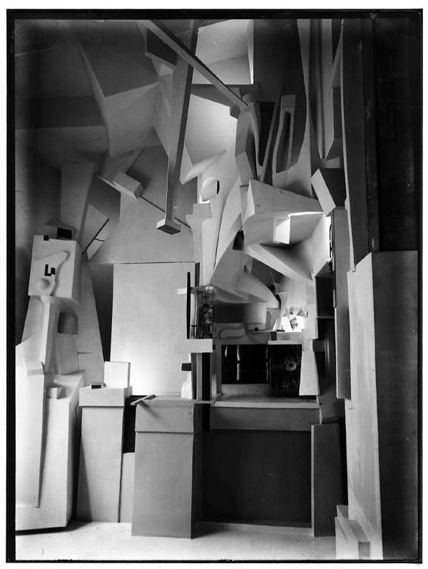
The image above is a scene of Schwitters' Merzbau, an ever changing installation he deemed to be his life's work. Merzbau translates to Merz Building, Merz being a term he used repeatedly in his work (from Commerz or Commerce). Schwitters's work on this piece started to overtake his studio and later other parts of the house, and featured three dimensional space and additions of found objects. Since the work was ever changing, earlier versions of the Merzbau might only exist in the viewer's memory. During the war the first Merzbau was destroyed, and Schwitters started on a second when he fled Germany, but that as well was never finished.
Wednesday, March 24, 2010

Saturday, March 20, 2010
"Seated Girl" by Egon Schiele

Gustav Klimt was a famous painter and one of the outstanding members of the Vienna Secession movement. He painted, did murals, and sketched, with his primary subject being the female body. He was a mentor to younger artists in the early 1900s. One artist he took interest in was young Egon Schiele, buying his drawings, arranging models for him, etc. Schiele's style was viewed as being grotesque, erotic, pornographic, and disturbing. It focused on sex, death, and discovery.
The painting "Seated Girl" is of a girl sitting upright and facing the viewer. She has no shirt on, just a blue skirt. You can easily tell that his style is very simplistic. There is little to no shaded value on the girl or aound her, and her skin is pure white. The only reason it does not blend into the background on teh paper is because the paper is of a manila color. Her body is not quite proportionate. Her upper arm muscles bulk out way too much and her upper body does not make a smooth and curvy transition down to her waist. Schiele is basically portrayng this girl as an erotic symbol in a non-realistic way.
Friday, March 19, 2010
Judith and the Head of Holofernes, Gustav Klimt

Beginning in 1897, The Vienna Secession was a movement of artists focused on the exploration of art and techniques outside of what was being taught in the more academic art world. One of the founding members of the group was Gustav Klimt, though several other artists aided in the founding. Done several years after the founding of the group, Klimt's Judith and the Head of Holofernes (1901) displays several aims of the Vienna Secession artists. While there wasn't a specific style seen by the artists, their general aim was to provide a venue for young artists to show their work in Vienna.
Judith and the Head of Holofernes falls into the period of Klimt's work called the "Golden Phase", and overlaps with his membership among the Vienna Secession artists. The paintings in this period are richly covered in gold leaf, and are highly focused on the use of pattern, much like is seen in Byzantine icons which Klimt may have seen on trips to Ravenna in Italy.
Man At the Crossroads

Man at the Crossroads was a mural painted by Diego Rivera at Rockefeller Center in New York City in 1933. Commissioned by the Rockefellers, the mural's subject matter was to include scientific, technological, political and social possibilities of the future. Rivera, sympathetic to the Russian cause at this period in history, painted the mural depicting Lenin leading a group of workers marching in a demonstration. The depict upset Nelson Rockefeller, who asked Rivera to repaint over Lenin's face an anonymous worker. Rivera refused, and one of his assistants took secret photographs before the finished mural was destroyed.
The work is significant not only because of the Russian/Mexican connection between the Communist party and Rivera, but also because this mural served as subject matter for another mural, painted in 1934 in Mexico City. This mural featured Lenin and Leon Trotsky. Rivera also painted another mural in New York City, "Portrait of America".
Wednesday, March 17, 2010


Monday, March 15, 2010
Roundhay Garden Scene, Le Prince, 1888
The Roundhay Garden Scene is one of the very earliest recorded films. Silent, and at 12 frames a second, it runs for only about two seconds and shows a gathering of friends in a garden owned by the Whitley family in Leeds, England. As with all film, it captures a moment in time (October 14, 1888), giving a look into the situation of 19th century middle-class families. The short film was directed by inventor Louis Le Prince, and is the first surviving film known to have been recorded on celluloid.
Le Prince recorded the scene several years before other competing inventors such as Edison and Lumière. Due to patent suits from Edison, as well as other financial problems and mysterious family issues, Le Prince never gained the recognition seen by other contemporary filmmakers and inventors.
Saturday, March 13, 2010
Kinetoscope

The kinetoscope was an early movie exhibition space. While it did not project film, it allowed individual viewers to watch the film inside the device. The kinetoscope creates the idea of motion by running a strip of film past a light source and shutter. While Edison is largely credited for thinking up the idea, it was actually executed by his employee William Dickson. Dickson was also responsible for the Kinetograph, a motion picture camera used to photograph movies and experiments at the lab.
Edison did not patent this invention and this allowed for various people and places to take the technology and run with it. This led to various imitations and improvements on the original idea. Like most technological advances, this early invention had an impact on the trajectory of cinematic development in the early part of the 20th century.
Friday, March 12, 2010
Edward Muybrige

Edward Muybrige was a famous photographer in the mid 1800's. In 1877 a man named Stanford, who was very interested in horse racing asked him to provide evidence that all four of a horses hooves left the ground while running. Muybrige set up 24 camera's around an arena and proceeded to attach them to thread. From this experiment, he practically invented animation. This also lead to him doing a series of pieces on human motion and animal locomotion. The basic idea was to snap pictures of the animal in motion, and white out the background. When the images were flipped quickly, they gave the appearance of the animal, or person moving. It works much like a flip book. I find it very interesting that photo's such as these were among the first types of cinema. It was only a few years after Muybrige's photo's that actual short movies began coming out. Among the first of those was the 1903 movie, The Great Train Robbery.
Thaumatrope (post 6)
http://www.youtube.com/watch?v=RyW-yUFMkRA&feature=related
I found this image of a Thaumatrope that seemed to me more detailed that others that I have stumbled across. The two images in this video combine to make the illusion of a man grabbing a baby caff by the tail. Each image is placed on separate sides on a circular object which have string that emerges from both sides. When the string is stun, the two images combine based on the way the human eye captures the visuals in the retina. One famous movie uses the Bird in the Cage thaumatrope as a essence of relative calmness. This can be seen in the Tim Burton film Sleepy Hollow.
I found this image of a Thaumatrope that seemed to me more detailed that others that I have stumbled across. The two images in this video combine to make the illusion of a man grabbing a baby caff by the tail. Each image is placed on separate sides on a circular object which have string that emerges from both sides. When the string is stun, the two images combine based on the way the human eye captures the visuals in the retina. One famous movie uses the Bird in the Cage thaumatrope as a essence of relative calmness. This can be seen in the Tim Burton film Sleepy Hollow.
www.youtube.com/watch?v=R0jm6j3s_uE
I looked up a video on youtube called "birth of cinema". The video covers the first photograph, to the first recorded sound, and ealry film as well. One thing that I found interesting was how cinema used to be associated with english rather than art largely, as we discussed, due to peoples' concern for the narrative of a film, not so much the cinematography. Due to the fact that there is no sound in early films, it seems like initially it should have been seen as more of an artistic piece rather than english studies. The techniques were so novel at the time, even as intricate as coloring one thing in each frame to create color, that the process seems to me to require a good amount of artistic ability. The youtube video talks about and shows films with magic/optical illusions, comedy, and all kinds of really interesting techniques. I would really reccomend watching it, it is really interesting.
I looked up a video on youtube called "birth of cinema". The video covers the first photograph, to the first recorded sound, and ealry film as well. One thing that I found interesting was how cinema used to be associated with english rather than art largely, as we discussed, due to peoples' concern for the narrative of a film, not so much the cinematography. Due to the fact that there is no sound in early films, it seems like initially it should have been seen as more of an artistic piece rather than english studies. The techniques were so novel at the time, even as intricate as coloring one thing in each frame to create color, that the process seems to me to require a good amount of artistic ability. The youtube video talks about and shows films with magic/optical illusions, comedy, and all kinds of really interesting techniques. I would really reccomend watching it, it is really interesting.

The Auditorium Building in Chicago was designed in 1886. The building houses the the auditorium theater, which was closed but later renovated, and re-opened. Roosevelt University purchased the building in 1946. The Auditorium Building, due to the soft ground from the lake in Chicago, has pontoonlike piers as a foundation to keep the building from sinking, although the Auditorium Building did sink in the first decade that it was built. This building is a mix between the style of old buildings and the innovative style of skyscrapers. The skyscrapers that were being built used different stronger materials as interior structures so that the building could be built up, not just out, and the outer walls were not so thick to provide the only support for the building. The Auditorium Building used more modern structural tactics, as well as having thicker walls. The design utilizes larger plate glass, as well as decorative faceting and pillars between floors and windows.
Saturday, February 27, 2010
The Monadnock Building by Frank Lloyd Wright

The Monadnock Building was designed by Frank Lloyd Wright and was finished being constructed in 1893. This is an office building and was the largest office building in the world when its construction was finished. The design of it is very simple, yet very powerful. The curves and design of the building are believed to be the beginning of modern architecture. This building is a great example of new technology that was introduced in the 19th century.
Every room in the building has an oak and glass entrance. The most noticeable innovation in the building, however, is the large windows. The side windows open up, allowing cross ventilation. Also, a lot of light is able to enter into each room in the Monadnock Building because of the size of the windows.
Friday, February 26, 2010
Falling Water

Falling Water was built by Frank Lloyd in the 1930's. The house is built in the prairie style that is so typical of his work. The smooth texture of the building, coupled with the light natural colors are all characteristic of prairie style homes. Furthermore, it is very Asian in nature. It is very asymmetrical and uneven, something very common in Asian architecture and also a very important aesthetic in Asian artworks and buildings. Lloyd did an amazing job designing this house, it almost seems to blend in and belong to the nature around it. This is primarily because of the sandy colors and the rock that the house is made of. The only downfall to it is the fact it is built over a waterfall. While the waterfall adds to the beauty of the scenery and the home, it makes it exceedingly hard to keep up with the house maintenance.
The Rookery, Burnham and Root

Rookery Building
Completed 1888
Burnham and Root
The Rookery Building, named for the previous building on the site that had become home to many birds, is built in the Loop in downtown Chicago. At 11 stories tall, it is not as tall as some of the pair's other designs. It does, however, utilize large windows to bring in light. These windows not only cover the outer walls, but also the roof, leading to an interior "Light Court". With The Rookery Building, Burnham and Root developed the technique of the floating foundation, especially necessary due to Chicago's unstable soil. They also integrated other developing techniques, such as the inner steel skeleton to support the building's height.
In the early 1900s, Frank Lloyd Wright completed a rennovation on the interior of the building. He used techniques also seen in his Prairie Style homes, using lighter colored materials and adding additional light inside. The Rookery is the only building within the downtown area of the city that Wright worked on. It is considered the oldest standing high-rise within the city of Chicago, and one of Burnham and Root's greatest designs. They housed their offices once it was completed, using it as their workspace during their designing of the 1893 Columbian Exposition in Chicago.
Hills-DeCaro House (post 5)

This is the Hills-DeCaro House located in Oak Park, IL. The house was built in 1906 in according to the design of Frank Lloyd Wright. It is one of many of Wright's geometrically shaped designs. This house features the same over lays on the roof and the porch just as seen in the design of Lloyd's Robey House. This particular house was influences by on of Wright's trips to Japan, as you can notice the ridges in the roof and house each section comes to a slight point near the top.
This particular house, along with three others of Wright's designs in Oak Park are currently hosting dinning for those interested in Wright's work. The houses have been transformed into fine dinning restaurants with reservations that have to be booked in advance. Tickets for dinning in the Hills-DeCaro run around $1,250 for members and $1,350 for non-members.
This particular house, along with three others of Wright's designs in Oak Park are currently hosting dinning for those interested in Wright's work. The houses have been transformed into fine dinning restaurants with reservations that have to be booked in advance. Tickets for dinning in the Hills-DeCaro run around $1,250 for members and $1,350 for non-members.
Dexter Building

Dexter Building
Built 1886
Adler & Sullivan
The Dexter Building is located in Chicago, originally built to be a commercial loft type space. Designed by the landmark firm Adler and Sullivan, this building was built before the more recognizable Auditorium Theatre Building that was discussed in class.
According to The City of Chicago website, "The building, which was erected by Chicago attorney Wirt Dexter, was initially used as a factory and showroom for R. Deimel & Brothers, a furniture manufacturing firm."
This building style is significant because of the style of construction. Plate glass and a cast iron building structure allowed for this building's "look". Also, the facade is practically devoid of ornament, unlike other buildings like the Home Insurance Building resembling a Greek column. Instead, the visual stress falls on the iron beams that run a vertical span of the height of the building.
Saturday, February 20, 2010
Post 4
 Jean Auguste Dominique Ingers
Roger Delivering Angelica.
1819. Oil on canvas.
This painting of Roger Delivering Angelica is currently located at the Musée Du Louvre in Paris, France. Here we see the image of Roger riding a Griffin with a golden lance shoved into the mysterious creature that appears to be attempting to attack maiden Angelica. The image features the fully clothed Roger and the naked female body of Angelica, which in some ways relates to style of the 19th century Herum paintings of this time.
Although Ingres was known for being a famous French Neo-Classical painter and sketcher, he must rather liked to be considered a historical painter. This painting clearly resembles a bit of each era of Romanticism, herum, and neo-classical idea all in one. The image of the naked body of Angelica is eliminated by the fare color of her skin in such a dark painting as this one. It is as if there is a light shining just out of view directly on the body of Angelica. This purpose of her body being lighter than the rest of the painting makes the female figure the center of attention, which also resembles to the herum painting because it attracts the male viewers as in a sort of fantasy.
From looking at the image and creating a quick analysis, one may believe that the male figure is delivering the naked female to the god of the sea. You can get this idea from the clouds above the head and the waves that are bouncing off the rocks at the base of the stones. There is also a small lighthouse in the background of the top right corner to give the illusion that the characters are not so far off the shoreline. "Roger" could be believed to be delivering the female to the sea to stop this storm that seems to be brewing in the background from coming, while also protecting her from other creates that may attempt to get her before she can be given to the god of the sea (Poseidon).
Friday, February 19, 2010
"A Japanese Imploring a Divinity" by Jean-Leon Gerome

The painting "A Japanese Imploring a Divinity" portrays basically what the title implies. The Japanese person is facing away from the viewer so we only get a view of the back, which tells us that the painting is not particularly about him. He is standing at the bottom of a huge flight of stairs with his arms raised outward up to the huge statue of a "divinity" sitting on top of the stairs. The Japanese man's body language and outstretched arms indicate that he is begging of something from the higher being. In this case, it seems he is begging for the divinity to stop the torture and suffering brought upon his culture and the orient.
You can clearly see the statue is meant to be a replication of a divine being. First of all, it is a huge statue and is set up high enough for all passers-by to see. Also, the bright orange and light against the blue sky (in this painting) really cause the statue to stand out. It is the brightest object in the painting, so your eye almost instantly lands on it. This whole piece goes to show you how people of the orient were being ruled over by people much more powerful than themselves.
Beardsley's Self Portrait in Bed
 Aubrey Beardsley's self portrait reflects one of the reasons his artistic career was so short: his constant battle with illness, most specifically tuberculosis. It most likely comes from around the time where he was art editor for the English literary magazine, The Yellow Book, whose publication ran from about 1894-1897. Tuberculosis would be the cause of Beardsley's death shortly thereafter in 1898. The text in the upper left corner translates to "by the twin Gods all monsters are not in Africa", not only hinting at the English attitudes toward Africa at the time, but also to the devastation that tuberculosis caused, often keeping him confined to his home and bed.
Beardsley's self portrait is quite recognizable as the style he used in most of his work, with a strong contrast and use of positive and negative space. The black of the bed curtains balances the white of the sheets and background, creating a strong flat area that nonetheless expresses the shapes of the folds of the fabric through its outline. The white rounds of flowers maintain an even pattern, and their shape mirrors that of both the tassels of the bed as well as the folds of fabric atop Beardsley's head. Within the white negative space, Beardsley uses a minimum of fine line to articulate the remaining shapes of his bed, his pillows, and himself. That he is so dwarfed by his bed and pillows suggests again the toll that his chronic disease took on him.
Paris Door

This is a door from a building in Paris. I was not able to find the architect or the year it was erected, but I thought it was a perfect example of art nouveau. The curves of the protruding concrete canopy are adorned with various organic shapes. The way the light drenches concrete accentuates the curves of the vines that are raised throughout the upper part of the door. The door consists of bent steel that resembles a tree-like figure. This figure is carried on in the two windows above the door. The shape of the door seems to be curved towards the top and even the windows up above are curved as opposed to a traditional rectangular window with sharp edges.
By using new technologies of bending wire and sculpting, the architectual artists were able to showcase the beauty of nature and its organic forms. Without these new technologies it would not be possible to create these forms, which is the genius of this style of art. The importance of nature is being brought out by modern (man-made) technologies of the time. The organic and inorganic now become dependant on each other. Without nature, the architects of the time would not be able to show off the new technologies of bending wire and sculpting organic forms; in return, without technology, nature would not be able to take the form of an inorganic structure.
William Morris' Red House

William Morris' Red House is a Victorian style red brick house located in South London. Designed by Morris and his friends Dante Gabriel Rossetti and Philip Webb, the house features handmade weaving, tapestries, stained glass and painted murals. Created during the Arts and Crafts movement, the house is a testament to the beauty of the handmade during increasing commercialization and industrialization of the time. The house itself is a work of art. This idea would be carried through to Frank Lloyd Wright as architecture and interior design merged to form a cohesive unit of beauty.
According to this biography of William Morris, "after Red House had been completed in 1861, the parties involved decided to found Morris, Marshall, Faulkner and Company: other founder-members included Ford Madox Brown, Burne-Jones, Rossetti, and Webb." Morris went on to be well known for his intricate wallpaper designs of organic and natural forms that drew inspiration from medieval ideas.

This painting is titled Snake Charmer by Jean-Leon Gerome. One thing that is different about this painting from other paintings we have seen is the point of view. Looking at the painting, there is no sense of identification with any particular person or group. The audience against the is looking at the boy, and has no attachment with the audience. At the same time, the boy who is the snake charmer is facing away from us as the observers which offers no sense of identification with him either. Also, the fact that we cannot see the front of the boy, and what the audience is looking at lends a curiousness and mystery to what is actually going on in the painting. Aside from a lack of identification with any of the characters in the painting, it seems as though the scene takes place long before the date in the late 1800s that it was painted. In the "Imaginary Orient," the author suggests that Gerome purposely portrays that oriental cultures are timeless, and that the rest of the world seemed to be advancing beyond them. In reality, this was not true, but it is how the cultures were portrayed.
Friday, February 12, 2010
Selfridge Lady London

Selfridge's opened it's doors in 1909. The building functioned much like a mall and was the first in London to present its goods as a display, similar to what Macy's and other department stores do now. Selfridge also had a massive impact on the way consumers perceived fashion and shopping with series of advertisements, the picture to the left is one of the many advertisements the store turned out. This particular one presents the goddess Nike wearing a crown of London and holding Selfridge. This image later came to represent shopping as a female desire. This icon became known as Lady London.
The Eixample, Ildefonso Cerdá Suñer

In 1859, shortly after Baron Haussmann was commissioned by Napoleon III to redesign Paris, Ildefonso Cerdá Suñer designed an urban extension to the city of Barcelona in Spain. Instead of military advantages, Suñer focused his urban planning around the concepts of efficiency and sanitation. His designs included open, green space for people to exist in as well as infrastructure to support the growing city of Barcelona. He called this extension the "Eixample".
In these original plans of the Eixample, you can see a spoke-like pattern of streets, much like the design seen radiating from the Arc de Triomphe in Paris. These wide streets and a grid-like pattern help to organize the streets in a way that is logical and easy to maneuver through, even in current modern vehicles. The streets widen at every corner as well, further emphasizing the original desire for space and efficiency. While the plans were revised more than once, the primary characteristics of the original plans were maintained. The neighborhoods contained within the Eixample would go on to house architectural works by Gaudi, easily integrated due to the original efficient design of Suñer.
Columbian Exposition Artifact

Souvenir Chinese baby doll from the Libbey Glass Pavilion, an exhibitor at the fair. The bunting is made of spun glass. (CHS 1980.8)
This doll, as the caption states, was a souvenir from the Columbian Exposition of 1893. One would think at first glance that it came from an exhibit about China, but instead was a promotion put out by the Libbey Glass company.
Interestingly enough, this artifact from the Exhibition ties in nicely with the articles we'll be discussing this week about the objectification of culture. One could guess Libbey was using the doll more to showcase the use of spun glass in the design, not to portray the doll in any sense of a "politically correct" or culturally sensitive way.
 This is a photo of a Nickelodean. This particular one still existed in South Carolina, columbia. The first theater was born in 1902. Not soon after they became one of the most popular activities. From this time to the 1930's urbanization was dominating. This brought a whole new type of culture and lifestyle. One major change was the nickelodean's. Before urbanization consisted of listening to the radio and mostly family activities within the home. Once people urbanized then amuzment arcades started showing short 15 miniute films. With dating and the new pop culture growing theaters became an everyday thing.
 In the window on the right is a picture of Charlie Chapmin. He has to be one of the first famous celeberties of his time. As you can see the Nickelodean would market him by what looks to be a cardboard cut out of Chapmin. The window shopping style of advertisement seems to be a bite of departmentstores. Just like they departmentstores it was a fixed price to see the movie, posters and signs in the windows and just the idea of the consumer leaving there home and driving to a building for entertainment was revolutionary.
Saturday, February 6, 2010
Blue Dancers

Degas, Blue Dancers
As we discussed in class, this painting is an example of how Degas painted many works with a composition resembling that of a photograph. The way the dancers' bodies are not completely on the canvas is a style most people are used to seeing in something similar to a snapshot. The highlighting on the dancers' shoulders creates a sharp accenuation on top of the soft brushwork Degas used to paint the bodies of the dancers. The close angle makes the viewer wonder what else is going on around the dancers. The use of the color blue is rather interesting and helps set the mood of the painting.
The universal blue tint that is throughout the painting seems to create an opposite atmoshphere than the viewer is accustomed to associating with dance. The shade of blue along with the overall haziness of the painting blend together to create a quiet, somber atmosphere: the somberness of work. Because of the varied body positions of the dancers, it is almost as if they are about to get ready to perform; all their grueling work and practice is about to pay off. This "behind the scenes" look helps shed light into how dance is a form of work for these girls. Most of them danced so they could help support their families. Although I'm sure most of the girls enjoyed dancing, it was a form of labor for them.
Friday, February 5, 2010
Louis-Jacques-Mandé Daguerre, 1844
 Jean-Baptiste Sabatier-Blot (French, 1801–1881)
Louis-Jacques-Mandé Daguerre, 1844
Daguerreotype; 14.3 x 11.7 cm
Jean-Baptiste Sabatier-Blot was a contemporary of the more famed artist, Daguerre, the subject of the above daguerreotype. Not much is known about Sabatier-Blot, but I was able to find some interesting facts about Daguerre and the daguerreotype. When I was looking for an image to show for this post, I wondered why there were so few to choose from. According to the Met Museum website, "Neither Daguerre's microscopic nor his telescopic daguerreotypes survive, for on March 8, 1839, the Diorama—and with it Daguerre's laboratory—burned to the ground, destroying the inventor's written records and the bulk of his early experimental works. In fact, fewer than twenty-five securely attributed photographs by Daguerre survive—a mere handful of still lifes, Parisian views, and portraits from the dawn of photography."
However, what does survive shows an insight into how life was "back in the day" and why I find the subject of Daguerre in a photograph to be so interesting. One reads so much about the man attributed to the advent of photography and here we can finally look at him in the medium he is so well known for. Had it been a painted portrait I don't think this image would've had so much impact, dust, scratches and all.
The Angelus, Jean-François Millet
_001.jpg)
The Angelus, painted by Jean-François Millet around 1857–59, has themes much like that of his more famous painting, The Gleaners. It illustrates a farming couple in a barren field, praying over their empty baskets. Much like The Gleaners, it focuses on the harsh realities of farm life. There is speculation that there was originally a child's coffin present in the field, somewhat supported by an x-ray that shows underpainting of a geometric shape, but the evidence is inconclusive. If Millet did originally intend for this to be a funeral scene, it would only further his focus on the theme of the harsh life of the working class.
The colors, much like Millet's other work, are muted and almost tranquil, contrasting the underlying theme of suffering. Though their plight is hard, their almost column-like positioning in the foreground helps them maintain a dignity and strength that Millet often emphasized in his portrayals of poor laborers.
The Dance Class

Edgar Degas' The Dance Class was painted in 1876 and depicts the hard labor ballerina's of the time were undergoing. The first thing my attention was drawn to was the girl in the foreground. She seems to be paying no attention to her instructor and appears to be reading the sheet music. Like her, the other girls in the painting appear to be uninterested and ignorant of their instructor. Many of the girls are sitting and appear to be talking to one another. This highlights the labor they were undergoing because their lack of attention and sitting down hints that perhaps they have been working all day, or are overworked. There are still a few girls stretching and the instructor watches them intently. However, the two stretching girls in the center drew my attention to the back of the painting where it looks as if there are two girls sitting on the floor observing their feet in what appears to be pain. Again this suggest that they are overworked and their job is strenuous.
JMW Turner (post 3)

JMW Turner
Rosenau
Tuner's painting started off as just sketches of the Rosenau castle in 1840, then decided to turn his sketches into an oil painting in 1841 in hopes that Price Albert who want to purchase his work for the castle. The royal family wasn't very excited with the way Turner portrayed the royal castle, so ultimately his painting was not bought by the royal family. His abstract way of painting was not considered good enough for the time. The castle witch belongs to Prince Albert and Queen Victoria is located above the trees in the top right corner of the painting.
It's said that Turner painted in a more "poetic" style when he created his work, using unique strokes to create his own version of what he was seeing at the time, I see his work as a more abstract way to express the moment and feeling of the day he sketched/painted the view from down by the lake looking up at the Rosenau castle. The painting gives off a sense of calmness through the light of the sky and the image of the male and female near the water side. It looks as if the male is enjoying fishing, while the female is just enjoying his company. I think the individuals might in some ways may be portrayed as Prince Adam and Queen Victoria. Also the color of the leaves leads me to believe that the seasons are changing from either summer to fall, or fall to winter.
It's said that Turner painted in a more "poetic" style when he created his work, using unique strokes to create his own version of what he was seeing at the time, I see his work as a more abstract way to express the moment and feeling of the day he sketched/painted the view from down by the lake looking up at the Rosenau castle. The painting gives off a sense of calmness through the light of the sky and the image of the male and female near the water side. It looks as if the male is enjoying fishing, while the female is just enjoying his company. I think the individuals might in some ways may be portrayed as Prince Adam and Queen Victoria. Also the color of the leaves leads me to believe that the seasons are changing from either summer to fall, or fall to winter.
Turner's landscape painting is located at the Walker Art Gallery in Liverpool England, and it's dimensions are 49.13 in x 38.27 in.
 This is a painting done in 1850 by Rosa Bonheur called Plowing in the Nivernais. This painting seems to me to be a good representation of the types of works we have discussed this past week. Like many of the others, this painting seems simple and somewhat relaxed. There are not intense brush strokes and color, but rather a more realist approach. In the wake of the industrial revolution was a fight for farmers and craftsmen struggling to keep up with machinery and large companies and factories.
 The cattle walking forward takes you from left to right across the painting as the men walk alongside urging them on, although, none the less there is a stillness to the painting. Despite the fact that this task from this painting is portrayed in an easy going manner, the work depicted is labor, and hard labor at that. The farmers plowing the field would have to be outside in the sun and heat, keeping the cattle on track, all day long. Once the field was plowed crops would have to be planted, and like many of the other paintings we have seen, this life is depicted as just another day in the life of a farmer.
"Dance Class at the Opera"

Dance Class at the Opera was painted by Edgar Degas in 1872. This is just one of many Degas' paintings that involve ballerinas or the art of ballet. In this painting you see various young ballerinas being instructed by the ballet master. As my eyes surveyed the scene i noticed quickly that most of the girls in the painting arent paying attention to the ballet master. Most of them are stretching their necks in pain, adjusting their costumes, or sitting trying to get a minutes rest. This highlights the fact that ballet is strenuous and often considered a form of labor, not to mention Degas' love for capturing the look of labor in a situation. The girl with the light blue bow on her outfit brought my attention to the right side of the painting. Over here i noticed what looks like a couple parents sitting in on the ballet lesson. a couple of the ballerinas look like they are getting comforted by their parents or they are just helping them adjust their costumes appropriately. From there my eyes slid across the painting to the girl standing right in the immediate foreground. She seems to be one of the few girls who is giving the ballet master undivided attention. She also looks like she is fanning her self, this also highlights the fact that they are performing a laborous task. To her left there is a girl sitting on the piano who looks aggravated about her uniform. Her facial expression says it all while she stretchs for an elusive itch. Upon first glimpse this is painting looks like any ordinary ballet practice, but given a second glance; this painting by Degas' really shows the attitude of the ballet scene in Paris.
Thursday, February 4, 2010
 This is a painting from Jules Breton in the 1850's. This painting is about peasant workers from the mid 19th century. These workers in particular where called Gleaners. They basically cleaned up the fields from the leftovers of the machinary. At this time peasants were seen as ugly, gross and a shame to society. It is very interesting to see the Gleaner in a posture that is almost heroic and pride like. Most other interpritations would show peasants unhappy, miserable, and tired. This painting portrays the exact opposite Not only does the posture enhance the heroic and pride like feeling, but also the steern facial expression. Not to metion this is a muscualar woman. The most amazing thing about this painting is that the eyes are not making contact with the viewer. Usually when I see a painting of a Gleaner they are either busy looking at their work or if they are looking at the viewer in an unhappy or needy way. This woman just gives me the vibe like "don't judge me, i'm an independent Gleaner and i'm doing just fine."
The figure in the center is definitly the main idea of the painting. I do like how the woman in the center is more clear and crisp then her surroundings. To me it seemed like the more blurred painterly style is more associated with heat, unhappy, unimportant. The fact that she is infront of that and a more linear style really saperates her from the background. Also the center woman has much or blacks and darken shadows that really help her pop, compared to her surroundings that have soft shadowing and a very light in terms of vibrance.
'Dancer on Stage' by Edgar Degas
 Edgar Degas is most famously known for his paintings of ballerinas. "Dancer on Stage" is a beautiful painting of a ballerina up front in the center. She is the main focus in this painting, while the other objects and dancers are in the background. Most of the works by Degas portray labor, which is why I like this piece. It is quite difficult to see where all of the labor is in it. The only hint of labor is probably in the back where the other ballerinas are gathered, while practicing or waiting to perform. However, the dancers in the background are very blurry and not in focus. It is almost as if Degas does not want to show labor.
The main dancer in this portrait is shown as beautiful and glowing. She is very pale and her dress radiates, which gives the girl a very light and graceful feeling. The brushstrokes of the floor have a very smooth pattern that blend in with her dress. This gives the sense of movement and adds onto the gracefulness. In this painting Degas does a good job at covering up the harshness of child labor.
Sunday, January 31, 2010
 The Slave Trade by Auguste-Francois Biard
I really like the strong contrast between the sun set and the figures in the forground. The figures are arranged in a crazy composition. The blacks are very overpowering. The shadows are darkened and where the light is present the highlights are brightened. The characters are all very different. Their are many different types of slaves and what appears to be buyers of the slaves. These elements give the sense of how the trade was crazy, and dark. Last, i would like to talk about the sunset. It is almost like an oxymoron, because its a beautiful sunset but its of a ship that symbolizes the dark days of the slave trade.
Saturday, January 30, 2010
La liberté guidant le peuple

Liberty Leading the People By Eugene Delacroix
The most obvious formal element is the strength of Liberty shown with a triangular composition, with the strongest most important figure at the peak in the center of the composition. This image truly captures a sense of triumph with the imagery of the figures, dead bodies, and debris in the background. The figures in the foreground tend to pop due to their contrast in comparison to the background. By capturing this strong sense of pride and awe, Delacroix truly captures the essence of Romanticism.
The Fighting Temeraire

JMW Turner, The Fighting Temeraire
This painting is stunning for many different reasons. The lighting on the ship is what first captures my attention. The soft edges of the ship connect well with the softness of the clouds in the sky. The light contrast between the burnt orange sunset and the light blue sky creates a calming mood and draws the eye to the right side of the painting. Another strong factor is the way Turner used color differentiation to create lines of perspective, as opposed to an actual structured line.
Another reason I chose this painting was for the way Turner showed how beautiful "the end" could be. This is supposed to show the end of the last journey of The Temeraire. As soon as the ship was close enough to the shore it was to be destroyed. The overall tranquil mood of the painting is seemingly opposite of what one would assume the mood might be in a situation where workers are about to destroy a man made object. To me, the ship's end can be used to shadow the end of an individual's life; to show how death is not a scary thing, but a beautiful stop in the course of nature. The haziness of the ship and the clouds help create an exestential connection between nature and man made creations. It shows how both man and nature not only affect each other, but also depend on each other, as well.
Friday, January 29, 2010
The Four Elements

I chose to discuss Thomas Cole's The Four Elements because of its romantic style and also because it is conflicting. The painting is clearly romanticized because it represents all four of the elements. In the distance there is a rain storm and to the right what appears to be a forest fire. In the foreground is a lake and then, of course, there is the element of earth. The romanticism in this painting is further demonstrated not only by the four elements shown all at once, but by the paintings representation of America.
To address my comment about the paintings conflicting quality, this painting creates a certain feel of serenity to me because of the hazy wilderness in the distance and because of the contrast of light and dark between the foreground and background. However, simultaneously, the painting also creates a feeling of chaos. The use of dark colors in the foreground coupled with the forest fire and the heavy rain storm in the distance make it seem like there is too much going on in the painting.
Subscribe to:
Posts (Atom)

